You have data, you want to present it visually. What kind of chart should you go for?
The answer depends mostly on what message you want to convey, and the number of parameters/values you are dealing with. Different types of charts – bar, pie, scatter chart etc. – are relevant in different scenarios, and it can be a daunting task deciding which would work most effectively in your case.
Chart Chooser helps you make the right choice. Tell it what you want the chart to show: comparison, distribution, trends, etc.? Based on your inputs, the tool displays the types of charts most suited to convey your message.
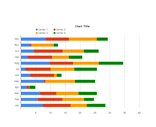
Chart Chooser displays a small visual sample of each chart type. You can download the templates for the charts as Excel or PowerPoint, and simply change the source data to your own data to create excellent graphs.

 Ankur Jain is a Software Engineer in Test Automation. After a 5 years stint with Accenture and Oracle, he started his eLearning company. A long-time blogger and proud owner of the "Learn" series of websites.